:root { --primary-color: #6B4226; /* Coffee brown */ --secondary-color: #A67C52; /* Light brown */ --accent-color: #D4A76A; /* Caramel */ --text-color: #333333; --light-bg: #F9F5F1; /* Cream */ --dark-bg: #1E1E1E; --header-font: 'Montserrat', sans-serif; --body-font: 'Merriweather', serif; } body { font-family: var(--body-font); color: var(--text-color); background-color: #FFFFFF; line-height: 1.6; margin: 0; padding: 0; } h1, h2, h3, h4, h5, h6 { font-family: var(--header-font); font-weight: 800; text-decoration: none!important; } .clean-link {text-decoration: none!important;} /* Header Styling */ .header { background-color: white; box-shadow: 0 2px 5px rgba(0,0,0,0.1); position: sticky; top: 0; z-index: 1000; } .logo-container { display: flex; align-items: center; padding: 10px 0; } .logo-image { width: 50px; height: 50px; } .logo-text { margin-left: 10px; font-size: 1.2rem; font-weight: 700; color: var(--primary-color); } .top-bar { background-color: var(--primary-color); color: white; padding: 8px 16px; text-align: center; font-family: var(--header-font); font-size: 0.9rem; } /** * Archive Page Styles for Good Morning Coffee Club */ /* Archive Header */ .page-header { margin-bottom: 2rem; padding-bottom: 1.5rem; border-bottom: 1px solid var(--color-border); } .page-title { font-family: 'Playfair Display', serif; font-size: 2.25rem; color: var(--color-primary); margin-bottom: 0.75rem; position: relative; } .page-title:after { content: ''; position: absolute; bottom: -10px; left: 0; width: 60px; height: 3px; background-color: var(--color-accent); } .archive-description { font-size: 1rem; color: var(--color-text-light); margin-top: 1rem; line-height: 1.6; } /* Archive Filter Bar */ .archive-filter { display: flex; justify-content: space-between; align-items: center; padding: 1.25rem 0; margin-bottom: 2rem; border-bottom: 1px solid var(--color-border); flex-wrap: wrap; gap: 1rem; } .archive-count { font-size: 1rem; color: var(--color-text-light); } .archive-title { font-weight: 600; color: var(--color-primary); } .archive-controls { display: flex; align-items: center; gap: 1.5rem; } .archive-sort { display: flex; align-items: center; gap: 0.5rem; } .archive-select { padding: 0.5rem; border: 1px solid var(--color-border); border-radius: 4px; font-size: 0.875rem; color: var(--color-text); background-color: var(--color-background); cursor: pointer; } .archive-view-options { display: flex; gap: 0.5rem; } .view-option { display: flex; align-items: center; justify-content: center; width: 40px; height: 40px; border: 1px solid var(--color-border); border-radius: 4px; background-color: var(--color-background); color: var(--color-text-light); cursor: pointer; transition: all 0.2s ease; } .view-option:hover { color: var(--color-primary); border-color: var(--color-primary); } .view-option.active { color: var(--color-background); background-color: var(--color-primary); border-color: var(--color-primary); } /* Mobile Navigation Drawer */ .mobile-nav { height: 100%; width: 0; position: fixed; z-index: 1001; top: 0; left: 0; background-color: var(--dark-bg); overflow-x: hidden; transition: 0.5s; padding-top: 60px; } .mobile-nav a { padding: 15px 25px; text-decoration: none; font-size: 1.1rem; color: white; display: block; transition: 0.3s; font-family: var(--header-font); border-bottom: 1px solid rgba(255,255,255,0.1); } .mobile-nav a:hover { color: var(--accent-color); } .mobile-nav .close-btn { position: absolute; top: 10px; right: 25px; font-size: 1.8rem; color: white; cursor: pointer; } /* Featured Slider */ .featured-slider { position: relative; overflow: hidden; background-color: #000; } .slide { height: 50vh; min-height: 300px; background-size: cover; background-position: center; position: relative; } .slide-overlay { position: absolute; bottom: 0; left: 0; right: 0; padding: 20px; background: linear-gradient(to top, rgba(0,0,0,0.8), transparent); color: white; } .slide-category { display: inline-block; background-color: var(--accent-color); color: white!important; padding: 5px 10px; border-radius: 3px; font-size: 0.9rem; text-transform: uppercase; margin-bottom: 10px; font-family: var(--header-font); font-weight: 900; } .slide-title { font-size: 1.5rem; margin: 5px 0 10px; font-weight: 700; } .slide-meta { font-size: 0.8rem; opacity: 0.8; } .slide-meta i { margin-right: 5px; } /* Category Pills */ .category-pills { padding: 15px 0; overflow-x: auto; white-space: nowrap; -webkit-overflow-scrolling: touch; background-color: var(--light-bg); } .pill { display: inline-block; padding: 8px 15px; margin: 0 5px; background-color: white; color: var(--primary-color); border-radius: 20px; font-size: 0.9rem; font-family: var(--header-font); box-shadow: 0 2px 5px rgba(0,0,0,0.1); } .pill.active { background-color: var(--primary-color); color: white; } /* Article Cards */ .article-card { margin-bottom: 20px; background-color: white; border-radius: 10px; overflow: hidden; box-shadow: 0 3px 10px rgba(0,0,0,0.1); transition: transform 0.3s; } .article-card:hover { transform: translateY(-5px); } .card-image { height: 200px; background-size: cover; background-position: center; } .card-content { padding: 15px; } .card-category { color: var(--accent-color); font-size: 0.8rem; text-transform: uppercase; font-family: var(--header-font); font-weight: 600; } .card-title { margin: 8px 0; font-size: 1.2rem; } .card-excerpt { font-size: 0.9rem; margin-bottom: 15px; color: #666; display: -webkit-box; -webkit-line-clamp: 3; -webkit-box-orient: vertical; overflow: hidden; } .card-meta { display: flex; justify-content: space-between; color: #888; border-top: 1px solid #eee; padding-top: 10px; } /* Section Headers */ .section-header { position: relative; margin: 30px 0 20px; padding-bottom: 10px; border-bottom: 2px solid #eee; } .section-header h2 { font-size: 1.5rem; margin: 0; display: inline-block; } .section-header::after { content: ''; position: absolute; width: 60px; height: 2px; background-color: var(--primary-color); bottom: -2px; left: 0; } .section-header .view-all { float: right; color: var(--primary-color); font-size: 0.9rem; text-decoration: none; font-family: var(--header-font); } /* Newsletter Section */ .newsletter-section { background-color: var(--primary-color); color: white; padding: 30px 20px; text-align: center; margin: 30px 0; } .newsletter-section h3 { font-size: 1.3rem; margin-bottom: 15px; } .newsletter-section p { font-size: 0.9rem; margin-bottom: 20px; opacity: 0.9; } .newsletter-form { display: flex; max-width: 400px; margin: 0 auto; } .newsletter-input { flex: 1; padding: 10px 15px; border: none; border-radius: 3px 0 0 3px; font-family: var(--body-font); } .newsletter-btn { background-color: var(--accent-color); color: white; border: none; padding: 10px 15px; border-radius: 0 3px 3px 0; cursor: pointer; font-family: var(--header-font); font-weight: 600; } /* Footer */ .footer { background-color: var(--dark-bg); color: white; padding: 30px 20px; } .footer-logo { text-align: center; margin-bottom: 20px; } .footer-logo img { width: 120px; } .footer-nav { margin-bottom: 20px; } .footer-nav a { color: white; text-decoration: none; padding: 5px 10px; font-family: var(--header-font); font-size: 0.9rem; } .social-icons { text-align: center; margin-bottom: 20px; } .social-icons a { color: white; font-size: 1.2rem; margin: 0 10px; display: inline-block; transition: transform 0.3s; } .social-icons a:hover { transform: scale(1.2); color: var(--accent-color); } .copyright { text-align: center; font-size: 0.8rem; opacity: 0.7; border-top: 1px solid rgba(255,255,255,0.1); padding-top: 20px; } /* FAQs Section */ .faq-item { margin-bottom: 15px; border-bottom: 1px solid #eee; padding-bottom: 15px; } .faq-question { font-weight: 600; cursor: pointer; padding: 10px 0; position: relative; font-family: var(--header-font); padding-right: 30px; } .faq-question::after { content: '\f078'; font-family: 'Font Awesome 6 Free'; font-weight: 900; position: absolute; right: 0; top: 10px; transition: transform 0.3s; } .faq-question.active::after { transform: rotate(180deg); } .faq-answer { display: none; padding: 10px 0; font-size: 0.9rem; } /* How-To Section */ .step-item { display: flex; margin-bottom: 20px; align-items: flex-start; } .step-number { width: 30px; height: 30px; background-color: var(--primary-color); color: white; border-radius: 50%; display: flex; align-items: center; justify-content: center; font-family: var(--header-font); font-weight: 600; flex-shrink: 0; margin-right: 15px; } .step-content { flex: 1; } .step-title { font-weight: 600; margin-bottom: 5px; font-family: var(--header-font); } /* Responsive Adjustments */ @media (min-width: 768px) { .featured-slider { height: 60vh; } .slide-title { font-size: 2rem; } .article-grid { display: grid; grid-template-columns: repeat(2, 1fr); gap: 20px; } .article-grid.featured { grid-template-columns: repeat(3, 1fr); } } @media (min-width: 992px) { .article-grid { grid-template-columns: repeat(3, 1fr); } .article-grid.featured { grid-template-columns: repeat(4, 1fr); } } /* Reading Mode Toggle */ .reading-mode-toggle { position: fixed; bottom: 20px; right: 20px; width: 40px; height: 40px; background-color: var(--primary-color); color: white; border-radius: 50%; display: flex; align-items: center; justify-content: center; box-shadow: 0 2px 10px rgba(0,0,0,0.2); cursor: pointer; z-index: 999; } body.dark-mode { background-color: #1a1a1a; color: #f0f0f0; } body.dark-mode .header, body.dark-mode .article-card { background-color: #2a2a2a; color: #f0f0f0; } body.dark-mode .category-pills { background-color: #1a1a1a; } body.dark-mode .pill { background-color: #333; color: #f0f0f0; } /* Loading Skeleton */ .skeleton { background: linear-gradient(90deg, #f0f0f0 25%, #e0e0e0 50%, #f0f0f0 75%); background-size: 200% 100%; animation: loading 1.5s infinite; border-radius: 4px; } @keyframes loading { 0% { background-position: 200% 0; } 100% { background-position: -200% 0; } } .skeleton-card .card-image { height: 200px; } .skeleton-card .card-category { height: 15px; width: 80px; margin-bottom: 10px; } .skeleton-card .card-title { height: 24px; margin-bottom: 10px; } .skeleton-card .card-excerpt { height: 60px; } /* Accessibility Widget Styles */ #accessibility-widget { position: fixed; top: 20px; right: 20px; z-index: 9999; } .accessibility-toggle { width: 50px; height: 50px; border-radius: 50%; background-color: #0078d7; color: white; display: flex; justify-content: center; align-items: center; cursor: pointer; box-shadow: 0 2px 10px rgba(0,0,0,0.2); transition: all 0.3s ease; } .accessibility-toggle:hover { background-color: #005ea2; transform: scale(1.05); } .accessibility-panel { position: absolute; top: 60px; right: 0; width: 300px; background-color: white; border-radius: 8px; box-shadow: 0 3px 15px rgba(0,0,0,0.2); display: none; overflow: hidden; } .panel-header { background-color: #0078d7; color: white; padding: 15px; text-align: center; font-weight: bold; } .panel-content { padding: 15px; } .accessibility-option { margin-bottom: 20px; } .option-label { font-weight: bold; margin-bottom: 8px; display: flex; align-items: center; } .option-label i { margin-right: 10px; width: 20px; text-align: center; } .option-controls { display: flex; gap: 5px; } .btn-option { flex: 1; text-align: center; padding: 8px; border: none; background-color: #f0f0f0; cursor: pointer; border-radius: 4px; transition: all 0.2s ease; } .btn-option:hover { background-color: #e0e0e0; } .btn-option.active { background-color: #0078d7; color: white; } /* Accessibility Styles */ body.high-contrast { background-color: black !important; color: white !important; } body.high-contrast * { background-color: black !important; color: white !important; border-color: white !important; } body.high-contrast a { color: yellow !important; } body.high-contrast button, body.high-contrast .btn-option { border: 1px solid white !important; } body.high-contrast .btn-option.active { background-color: white !important; color: black !important; } body.high-contrast img { filter: grayscale(100%) contrast(120%); } body.font-size-large { font-size: 120% !important; } body.font-size-larger { font-size: 150% !important; } body.font-size-largest { font-size: 200% !important; } body.text-spacing { letter-spacing: 1px !important; word-spacing: 3px !important; line-height: 2 !important; } body.dyslexia-friendly { font-family: "OpenDyslexic", "Comic Sans MS", cursive !important; } body.highlight-links a { text-decoration: underline !important; font-weight: bold !important; } .skip-link { position: absolute; left: -9999px; top: 10px; z-index: 10000; } .skip-link:focus { left: 10px; padding: 10px 20px; background: #0078d7; color: white; text-decoration: none; border-radius: 4px; } /** * Post Grid Styles for Good Morning Coffee Club * For use with the Underscores.me theme */ :root { --primary: #6F4E37; --primary-dark: #3A2D21; --secondary: #D2B48C; --light: #F5F5DC; --accent: #C87F0A; --text: #333333; --text-light: #777777; --border: #EEEEEE; --background: #FFFAF0; --card-shadow: 0 2px 15px rgba(0, 0, 0, 0.05); --transition: all 0.3s ease; } /** * Archive Header */ .page-header { margin-bottom: 2rem; padding-bottom: 1rem; border-bottom: 1px solid var(--border); } .page-title { font-family: 'Playfair Display', serif; font-size: 2rem; color: var(--primary-dark); margin-bottom: 0.5rem; position: relative; } .page-title:after { content: ''; position: absolute; bottom: -0.5rem; left: 0; width: 3.125rem; height: 0.1875rem; background-color: var(--accent); } .archive-description { color: var(--text-light); line-height: 1.6; margin-top: 1rem; } /** * Archive Toolbar */ .archive-toolbar { display: flex; justify-content: space-between; align-items: center; padding: 1rem 0; margin-bottom: 1.5rem; flex-wrap: wrap; gap: 1rem; } .post-count { color: var(--text-light); font-size: 0.9375rem; } .view-controls { display: flex; align-items: center; gap: 1rem; } .view-controls span { color: var(--text-light); } .posts-sort { padding: 0.5rem; border: 1px solid var(--border); border-radius: 0.25rem; background-color: var(--background); color: var(--text); font-size: 0.875rem; } .layout-toggles { display: flex; gap: 0.5rem; } .layout-toggle { display: flex; align-items: center; justify-content: center; width: 2.5rem; height: 2.5rem; border: 1px solid var(--border); border-radius: 0.25rem; background-color: var(--background); color: var(--text-light); cursor: pointer; transition: var(--transition); } .layout-toggle:hover { color: var(--primary); border-color: var(--primary); } .layout-toggle.active { background-color: var(--primary); color: white; border-color: var(--primary); } /** * Posts Grid */ .posts-grid { display: grid; grid-template-columns: repeat(auto-fill, minmax(300px, 1fr)); gap: 1.875rem; margin-bottom: 3rem; } /* Grid View (Default) */ .posts-grid.grid-view { grid-template-columns: repeat(auto-fill, minmax(300px, 1fr)); } /* List View */ .posts-grid.list-view { grid-template-columns: 1fr; gap: 1.5rem; } .posts-grid.list-view .grid-item .post-inner { display: flex; flex-direction: row; align-items: flex-start; } .posts-grid.list-view .grid-item .post-thumbnail { width: 15.625rem; flex-shrink: 0; margin-right: 1.5rem; margin-bottom: 0; } .posts-grid.list-view .grid-item .post-content { flex: 1; } .posts-grid.list-view .grid-item .entry-title { font-size: 1.5rem; } /* Grid Item */ .grid-item { background-color: white; border-radius: 0.5rem; overflow: hidden; box-shadow: var(--card-shadow); transition: var(--transition); opacity: 0; transform: translateY(20px); animation: fadeInUp 0.6s forwards; } /* Animation for grid items */ @keyframes fadeInUp { to { opacity: 1; transform: translateY(0); } } .grid-item:hover { box-shadow: 0 5px 25px rgba(0, 0, 0, 0.1); transform: translateY(-5px); } .grid-item .post-inner { display: flex; flex-direction: column; height: 100%; } .grid-item .post-thumbnail { position: relative; margin-bottom: 1rem; overflow: hidden; } .grid-item .post-featured-image { width: 100%; height: 13.75rem; object-fit: cover; transition: var(--transition); } .grid-item:hover .post-featured-image { transform: scale(1.05); } .grid-item .post-category { position: absolute; top: 1rem; left: 1rem; background-color: var(--accent); color: white; font-size: 0.75rem; text-transform: uppercase; padding: 0.3125rem 0.625rem; border-radius: 0.25rem; text-decoration: none; transition: var(--transition); } .grid-item .post-category:hover { background-color: var(--primary); } .grid-item .post-content { padding: 0 1.5rem 1.5rem; display: flex; flex-direction: column; flex-grow: 1; } .grid-item .entry-header { margin-bottom: 1rem; } .grid-item .entry-title { font-family: 'Playfair Display', serif; font-size: 1.25rem; margin-bottom: 0.75rem; line-height: 1.4; } .grid-item .entry-title a { color: var(--primary-dark); text-decoration: none; transition: var(--transition); } .grid-item .entry-title a:hover { color: var(--accent); } .grid-item .entry-meta { display: flex; flex-wrap: wrap; gap: 1rem; font-size: 0.8125rem; color: var(--text-light); margin-bottom: 0.5rem; } .grid-item .entry-meta a { color: var(--text-light); text-decoration: none; transition: var(--transition); } .grid-item .entry-meta a:hover { color: var(--primary); } .grid-item .entry-meta svg { margin-right: 0.3125rem; vertical-align: middle; } .grid-item .posted-by { display: flex; align-items: center; } .grid-item .author-avatar { margin-right: 0.375rem; border-radius: 50%; } .grid-item .entry-content { color: var(--text); line-height: 1.6; margin-bottom: 1.5rem; } .grid-item .entry-content p { margin-bottom: 0.75rem; } .grid-item .entry-content p:last-child { margin-bottom: 0; } .grid-item .entry-footer { margin-top: auto; } .grid-item .read-more { display: inline-flex; align-items: center; color: var(--primary); font-weight: 600; text-decoration: none; transition: var(--transition); } .grid-item .read-more svg { margin-left: 0.375rem; transition: var(--transition); } .grid-item .read-more:hover { color: var(--accent); } .grid-item .read-more:hover svg { transform: translateX(0.3125rem); } /** * Pagination */ .navigation.pagination { margin-top: 3rem; display: flex; justify-content: center; } .navigation.pagination .nav-links { display: flex; flex-wrap: wrap; gap: 0.5rem; } .page-numbers { display: flex; align-items: center; justify-content: center; width: 2.5rem; height: 2.5rem; background-color: white; border: 1px solid var(--border); border-radius: 0.25rem; color: var(--text); text-decoration: none; transition: var(--transition); } .page-numbers.current { background-color: var(--primary); border-color: var(--primary); color: white; } .page-numbers:not(.current):hover { background-color: var(--light); border-color: var(--primary); color: var(--primary); } .page-numbers.prev, .page-numbers.next { width: auto; padding: 0 1rem; } .page-numbers.prev svg, .page-numbers.next svg { width: 1.25rem; height: 1.25rem; } .page-numbers.prev svg { margin-right: 0.375rem; } .page-numbers.next svg { margin-left: 0.375rem; } /** * Responsive */ @media (max-width: 992px) { .posts-grid.grid-view { grid-template-columns: repeat(2, 1fr); } } @media (max-width: 768px) { .archive-toolbar { flex-direction: column; align-items: flex-start; } .posts-grid.grid-view { grid-template-columns: 1fr; } .posts-grid.list-view .grid-item .post-inner { flex-direction: column; } .posts-grid.list-view .grid-item .post-thumbnail { width: 100%; margin-right: 0; margin-bottom: 1rem; } .grid-item .post-featured-image { height: 11.25rem; } } /** * No Posts Found */ .no-results { text-align: center; padding: 3rem 0; } .no-results .page-header { margin-bottom: 1.5rem; border-bottom: none; } .no-results .page-title { font-size: 1.75rem; } .no-results .page-content { color: var(--text-light); max-width: 37.5rem; margin: 0 auto; } .facebook_color {color:#1877F2!important;padding:10px!important;}
Your Daily Dose of Digital Marketing Insights

Finding the Perfect Blog Posting Frequency for SEO Success

Graph illustrating the relationship between blog posting frequency and website traffic.

Discover how to determine the ideal blog posting frequency to boost your SEO efforts. Learn best practices and strategies to increase website traffic and engagement.

Finding the Perfect Blog Posting Frequency for SEO Success

30-Second Summary: Determining the optimal blog posting frequency is crucial for enhancing your website’s SEO performance. Regular, high-quality content can improve search engine rankings and drive more traffic. However, the ideal frequency varies based on your audience, resources, and goals. This guide explores best practices to help you find the right balance between consistency and quality in your blogging strategy. #Blogging #SEO #ContentMarketing #DigitalMarketing #BlogFrequency #SEOTips


In the digital age, blogging has become a cornerstone of effective online marketing. Regularly publishing content not only engages your audience but also plays a significant role in search engine optimization (SEO). But how often should you publish blog posts to maximize your SEO efforts? Striking the right balance between frequency and quality is key to achieving optimal results.

Understanding Blog Posting Frequency and SEO

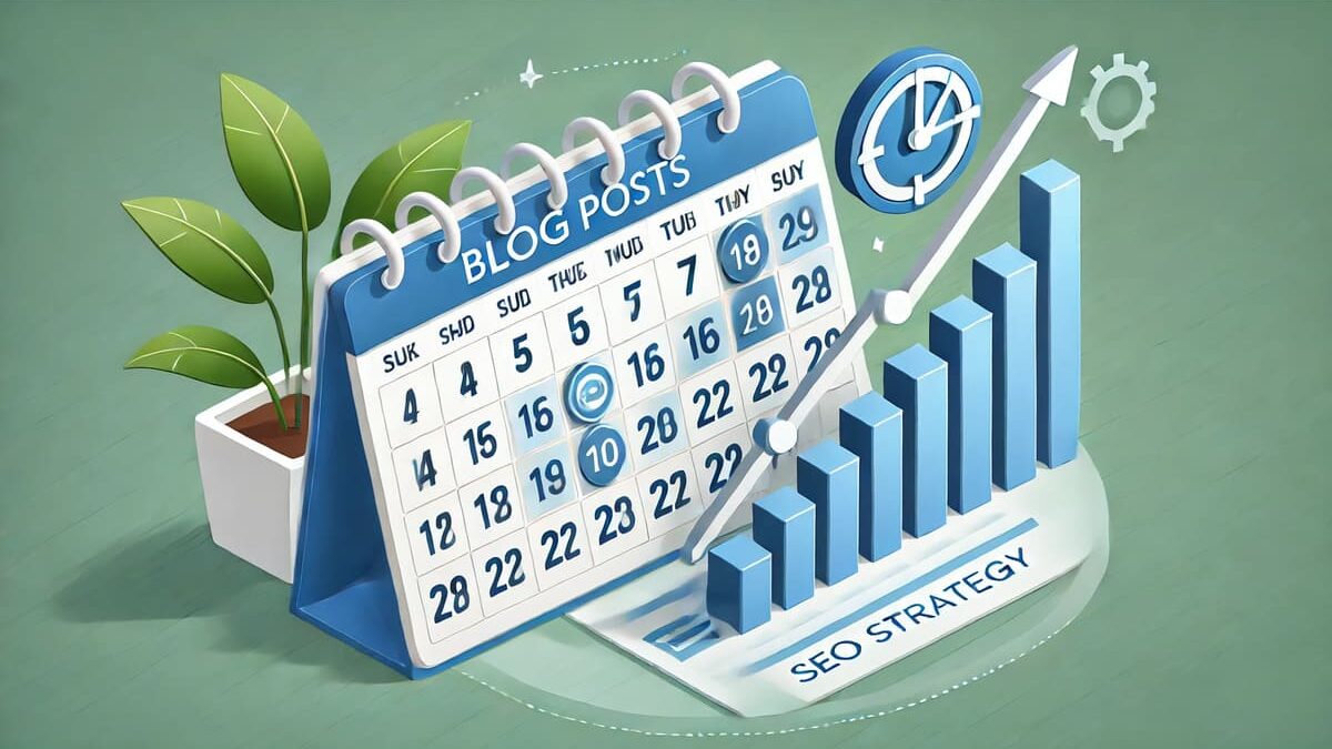
Blog posting frequency refers to how often you publish new content on your blog. Consistent posting keeps your audience engaged and signals to search engines that your site is active, which can positively impact your rankings. However, it’s not just about quantity; the quality of your content is equally important.

Key Factors to Consider:

  • Audience Expectations: Understand how often your readers expect new content.
  • Resource Availability: Ensure you have the time and resources to maintain consistent, high-quality posts.
  • Industry Standards: Consider the typical posting frequency within your industry.

Best Practices for Determining Your Blog Posting Frequency

  1. Assess Your Goals: Define what you aim to achieve with your blog—be it increased traffic, lead generation, or brand awareness.
  2. Analyze Your Audience: Research your target audience’s preferences and behaviors to tailor your posting schedule accordingly.
  3. Create a Content Calendar: Plan your posts in advance to maintain consistency and ensure a steady flow of content.
  4. Monitor Performance: Use analytics tools to track the performance of your posts and adjust your strategy as needed.
  5. Prioritize Quality Over Quantity: It’s better to publish fewer high-quality posts than to churn out low-quality content frequently.

Did You Know?

According to a study by HubSpot, companies that publish 16 or more blog posts per month receive nearly 3.5 times more traffic than those that publish four or fewer posts. However, this doesn’t mean more is always better; the key is to find a sustainable frequency that maintains quality and aligns with your goals.

Finding the perfect blog posting frequency is a balancing act that requires understanding your audience, setting clear goals, and consistently delivering high-quality content. By implementing these best practices, you can enhance your SEO efforts, engage your readers, and drive more traffic to your website.

Takeaway: Consistency and quality are the pillars of a successful blogging strategy. By carefully determining your optimal posting frequency, you can effectively boost your SEO performance and achieve your marketing objectives.

, , , , , ,

You Might Also Like

Placeholder Image for Google Checks To See If XML Sitemaps Change Before Reprocessing

Google Checks To See If XML Sitemaps Change Before Reprocessing

Google’s Gary Illyes confirmed that Google does indeed check to see if an XML sitemap has a change in it before reprocessing the XML sitemap file.
Placeholder Image for The Top 3 Ways To Build Authority By Going Beyond Just Link Building

The Top 3 Ways To Build Authority By Going Beyond Just Link Building

Learn how to rank higher on SERPs & elevate your online authority through content promotion, link building, & subject matter expertise.
Placeholder Image for Report: Google search will debut chatbot features this year

Report: Google search will debut chatbot features this year

Google has put A.I. ‘front and center’ and sought help from founders Larry Page and Sergey Brin on their A.I. strategy.
Placeholder Image for 5 Times ChatGPT Steered Me Wrong in Local SEO

5 Times ChatGPT Steered Me Wrong in Local SEO

If it looks like a cat and sits like a cat, it must be… OpenAI’s ChatGPT is a novelty that most SEOs are exploring right now for its ability to have a conversation with us about complex questions. It may be a major search disruptor and a threat to Google, a useful tool, a source of inspiration, and a societal... <a class="read-more" href="https://goodmorningcoffee.club/index.php/2023/01/15/5-times-chatgpt-steered-me-wrong-in-local-seo/">more...</a>
Good Morning Coffee Club