Discover how combining SMS and email marketing can enhance customer engagement and drive online sales. Learn practical strategies to integrate these channels effectively for your eCommerce business.
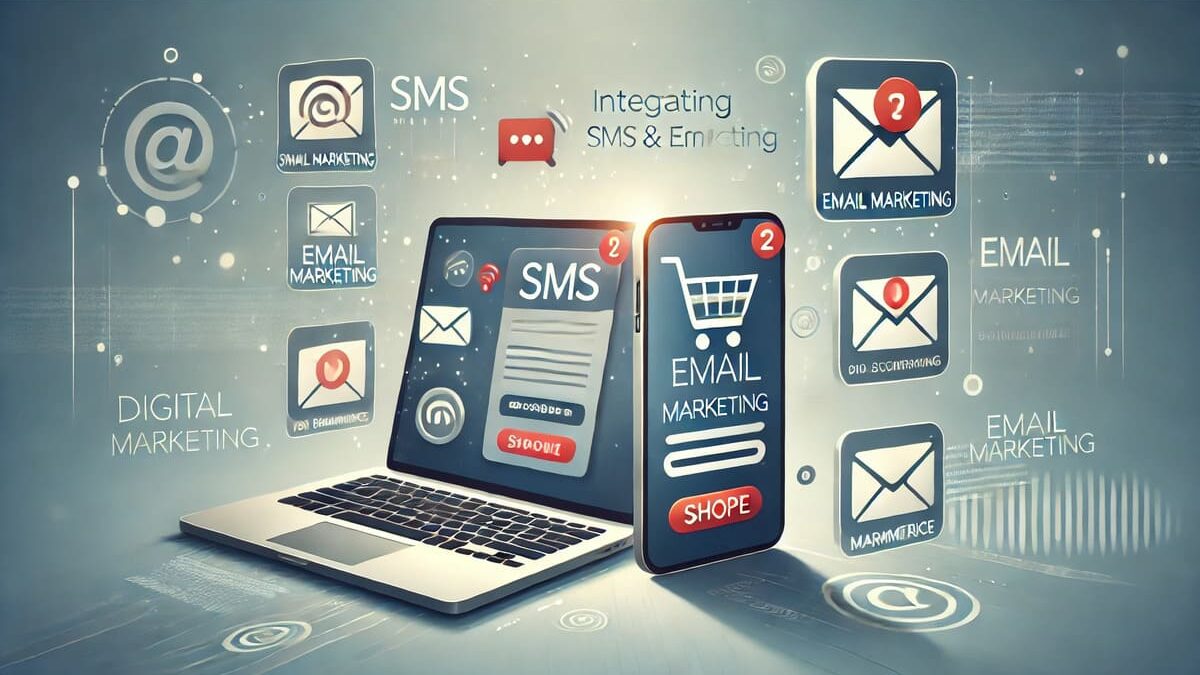
Integrating SMS and Email Marketing for eCommerce Success
30-Second Summary: Combining SMS and email marketing offers eCommerce businesses a powerful way to engage customers and boost sales. By integrating these channels, you can deliver timely, personalized messages that enhance the customer experience and drive conversions. This guide explores the benefits of this integration and provides actionable strategies to implement it effectively. #SMSMarketing #EmailMarketing #eCommerce #DigitalMarketing #CustomerEngagement
Integrating SMS and Email Marketing for eCommerce Success
In the competitive world of eCommerce, reaching customers through multiple channels is essential. While email marketing has long been a staple, incorporating SMS marketing can significantly enhance your outreach. This integration allows businesses to communicate more effectively, leading to increased customer engagement and higher sales.
Why Integrate SMS and Email Marketing?
- Enhanced Customer Engagement: SMS messages boast high open rates, often around 98%, making them ideal for time-sensitive promotions.
- Complementary Strengths: Emails are perfect for detailed content, while SMS delivers concise, immediate messages.
- SMS MarketingBroader Reach: Combining both channels ensures you connect with customers through their preferred communication method.
Strategies for Effective Integration
-
Unified Messaging
- Consistent Branding: Ensure your brand voice and messaging are consistent across both channels to build trust.
- Coordinated Campaigns: Align your SMS and email campaigns to reinforce messages and promotions.
-
Segmentation and Personalization
- Audience Segmentation: Divide your audience based on behavior and preferences to send targeted messages.
- Personalized Content: Use customer data to tailor messages, increasing relevance and engagement.
-
Automated Workflows
- Abandoned Cart Recovery: Send an email followed by an SMS reminder to encourage customers to complete their purchase.
- Order Confirmations: Use emails for detailed receipts and SMS for immediate confirmations.
-
Optimal Timing and Frequency
-
- Timing: Send SMS messages between 1 pm and 5 pm, and emails between 9 am and 3 pm for maximum effectiveness.
- Frequency: Limit SMS to 1-2 messages per week to avoid overwhelming customers.
Benefits of Integration
- Increased Conversion Rates: Coordinated campaigns can lead to higher conversion rates by reaching customers through multiple touchpoints.
- Improved Customer Experience: Providing timely and relevant information enhances the overall customer journey.
- Cost-Effectiveness: Leveraging both channels can be more cost-effective than relying on a single method.
Did You Know?
Businesses that integrate SMS and email marketing see an average of 20.5% of total online revenue from SMS, with customers generating $71 for every dollar spent on text message marketing programs.
Integrating SMS and email marketing is a powerful strategy for eCommerce businesses aiming to enhance customer engagement and drive sales. By leveraging the strengths of both channels, you can create a cohesive communication strategy that resonates with your audience and fosters long-term loyalty.
Learn how integrating SMS and email marketing can boost your eCommerce business. This guide provides practical strategies to combine these channels effectively, enhancing customer engagement and driving sales.
Takeaway:
By thoughtfully integrating SMS and email marketing, eCommerce businesses can create a more engaging and effective communication strategy. This approach not only improves customer experience but also contributes to increased sales and brand loyalty.
automated SMS and email campaigns, benefits of SMS and email marketing, best practices for SMS and email integration, customer engagement, digital marketing, drive eCommerce sales with SMS marketing, eCommerce marketing, eCommerce marketing strategies, email integration, email marketing, how to combine SMS and email for eCommerce, improve email open rates with SMS reminders, increase customer engagement with SMS and email, integrating SMS and email marketing, marketing automation, mobile marketing, online sales, SMS integration, SMS marketing, use SMS for abandoned cart recovery